Deriving Insights from Google Analytics data using Looker Studio
In today’s age of digital marketing, it is imperative to have an online presence for businesses to stay relevant. We look at a use case of how Google Looker Studio can be used to analyze Google Analytics data to provide insights for propelling business footprint and ROI.
Google Looker Studio, formerly Data Studio, is a tool that can be used to explore and visualize data from multiple sources in the form of customizable interactive dashboards which provide business insights and enable team collaboration. Google Looker Studio supports various connector types for Google Sheets, CSV file, Databases like BigQuery, MySQL, Google Marketing Platform products , Google Consumer products, Social media platforms, Blended data from a combination of related sources etc.
Google Analytics is one of the leading web analytics platforms which helps track online traffic, understand customer engagement journeys across platforms, and how it influences user experience, conversion and retention.
The new version of Google Analytics , Google Analytics 4 or GA4 in short, provides more advanced cross device tracking capabilities, allowing website and app data to be collected as events in the same property, thereby allowing a more holistic understanding of customer journeys . It also provides enhanced data privacy controls and machine learning capabilities to identify trends and predict user behaviour.
In Google Looker studio we use dimensions and metrics for visualizations. Dimensions are labels or descriptions which represent the data and metrics are measurements or numeric values like SUM, AVG, COUNT etc.
Let us look at some of the key steps required to create a holistic view of customer engagement by integrating Google Looker Studio and Google Analytics.
Adding a data source
We will open Google Looker Studio and add a report and Add data to the report by selecting Google Analytics.
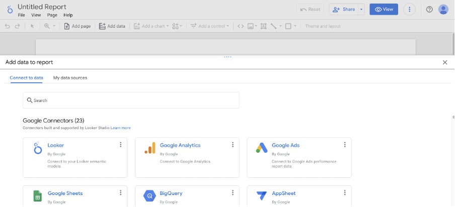
Select the Account and GA4 property and click Add and Add to Report.
Provide a name for the report, it is a Web Analytics Dashboard.
Score Cards
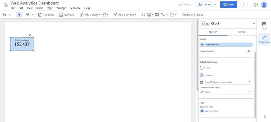
Click Add a chart and add score card for Total Sessions in the last 30 days
In Chart Setup, Metric section, select Sessions and rename it to total sessions using the edit icon next to it. In the Default data range section select Custom and select last 30 days excluding today. Formatting can be done from the Style section as required.
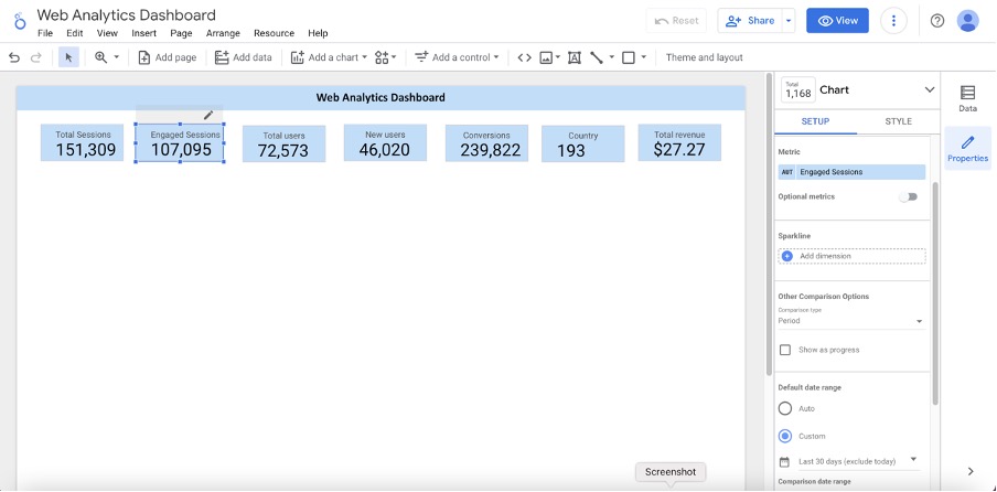
In a similar manner score cards can be added for the following metrics by copy pasting the formatted score card box and updating the metrics from the Chart Setup section.
- Engaged Sessions
- Total Users
- New Users
- Conversions
- Country
- Total Revenue
Google Maps
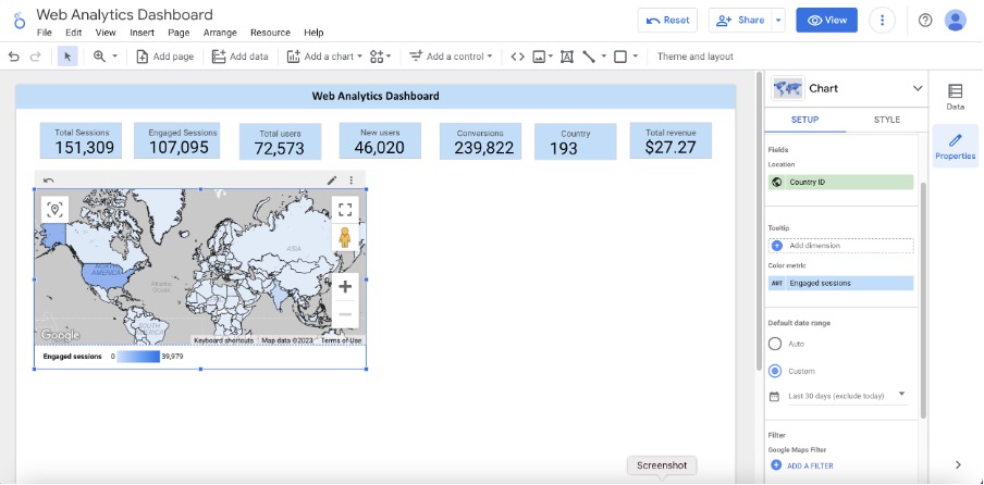
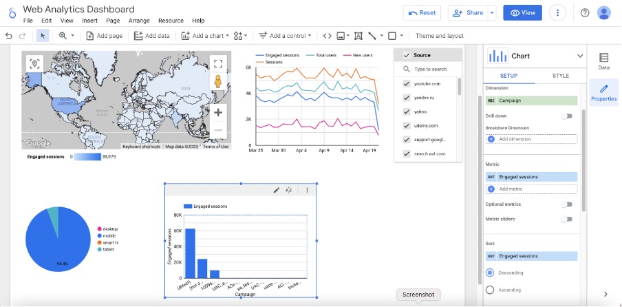
Next from Add a chart select a Google map (filled map) to obtain a view of how the Engaged sessions are distributed geographically.
Time Series line graph
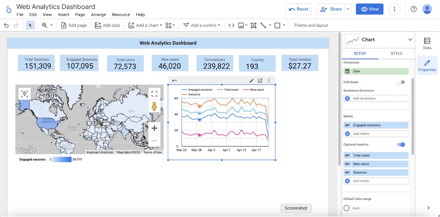
Next add a Time Series plot for number of Engaged Sessions per day over the last 30 days Include Optional Metrics for the following:
- Total number of users
- New Users
- Sessions
Fixed Size List
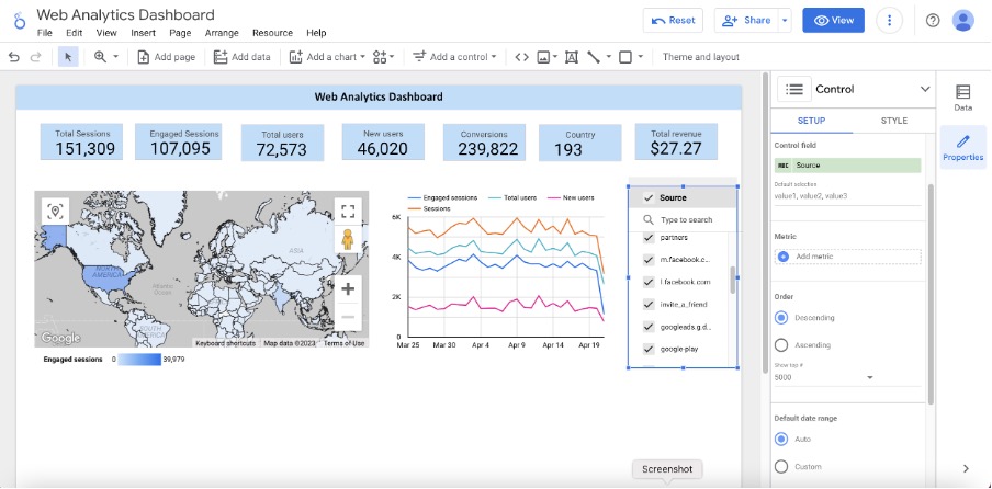
Add a control to see the different users fixed size input , list of sources Filter and see what is coming from different sources.
Pie Chart
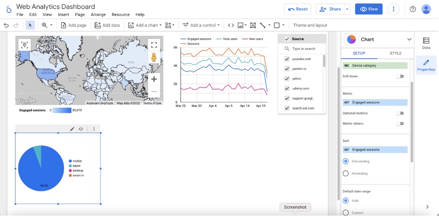
Add a Pie Chart to obtain an understanding of the device categories for the Engaged Sessions.
Bar Chart
Add a bar chart to review how campaigns impacted customer engagement, by displaying top campaigns.
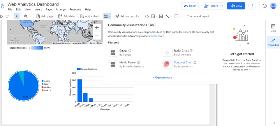
Community visualizations
We can also add Community visualizations which are components built by third-party developers to visualize some metrics.
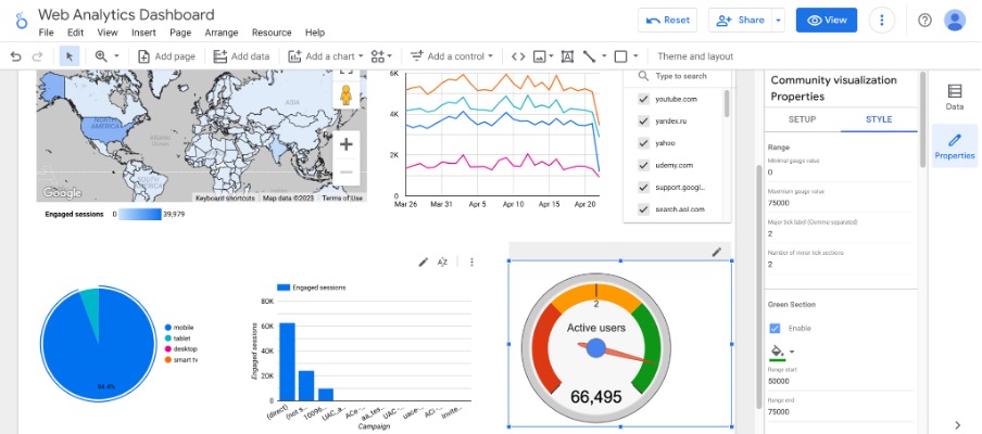
Select Gauge and then select Active Users in the last 30 days . Next from the Style tab select the range and the red , amber and green sections appropriately.
Click on View to have a look at the final dashboard.
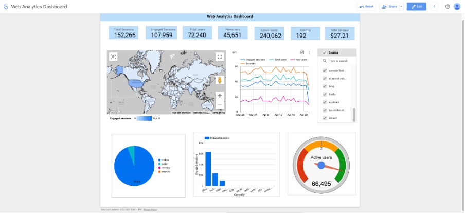
As we have seen above, Google Looker Studio provides multiple features for data exploration, visualization and collaboration. The informative reports can be a very useful tool for deriving business insights and decision making.